Scatterplots visualize the relationship between two numeric variables in which one variable is displayed on the x-axis, and the other variable is displayed on the y-axis. For each record, a point is plotted where the two variables intersect on the chart. When the resulting points form a nonrandom structure, a relationship exists between the two variables.
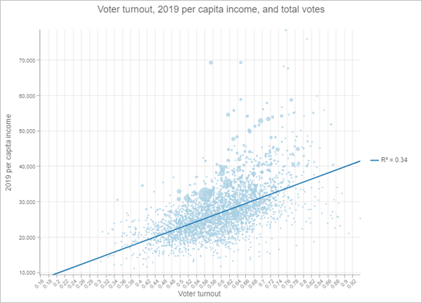
Optionally, a third numeric variable can be specified to proportionally size each point in the plot. This is sometimes referred to as a bubble plot.
Example
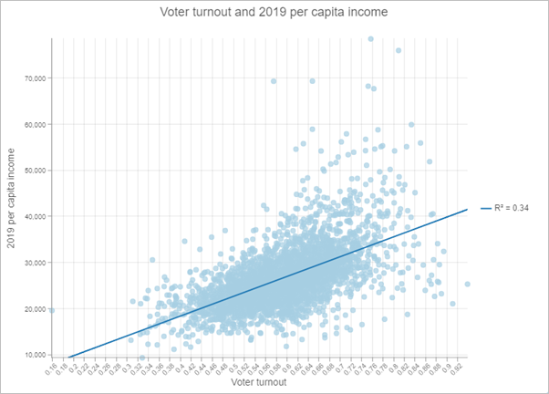
The scatterplot below visualizes the relationship between voter turnout in the 2016 United States election and the 2019 per capita income.
- X-Axis—Voter turnout
- Y-Axis—2019 per capita income

An optional third numeric variable sizes the points proportionally to show total votes.

Data
The Data tab  configurations include the variables that are used to create a scatterplot, the statistics displayed on the chart, and symbol configurations.
Variables
Scatterplots are composed of two number variables: X-axis number and Y-axis number.
Statistics
A regression equation is calculated and the associated trend line and R² value can be plotted on the scatterplot. The trend line models the linear relationship between x and y, and the R² value quantifies how well the data fits the model. These statistics are only relevant for linear relationships. The Show linear trend parameter is used to display and remove the trend line from the scatterplot. To change the color of the trend line, click the color swatch for the Trend line style parameter and choose a new color.
When small x-values correspond to small y-values, and large x-values correspond to large y-values (line sloping upward), this indicates a positive correlation. When small x-values correspond to large y-values, and large x-values correspond to small y-values (line sloping downward), this indicates a negative correlation.
Note:
It is important to note that x being correlated to y does not imply that x causes y.
Symbol
You can change the size and color of the symbols on a scatterplot.
Size
Scatterplot points can be fixed in size or sized proportionally by a numeric attribute. Sizing scatterplot points proportionally based on a third numeric variable adds another dimension to the visualization.
Color
Scatterplot points can be visualized using a single color or with the colors specified in the layer's style. By default, scatterplots use layer colors and inherit their outline and fill colors from the source layer style. By symbolizing a layer with a different attribute than either of the scatterplot variables, you can show an additional dimension on the scatterplot visualization.
Axes
The Axes tab  configurations are used to change the specifications for the x- and y-axes. Both axes include configurations for scale, minimum and maximum bounds, and number formatting.
Logarithmic scale
By default, scatterplot axes are displayed on a linear scale. You can display one or both axes on a logarithmic scale using the Logarithmic scale slider.
Logarithmic scales are useful when visualizing data with large positive skew when the majority of data points have a small value, with a few data points with very large values. Changing the scale of the axis does not change the value of the data—only the way it is displayed.
Linear scales are based on addition, and logarithmic scales are based on multiplication.
On a linear scale, each increment on the axis represents the same distance in value. For example, in the axis diagram below, each increment on the axis increases by adding 10.

On a logarithmic scale, increments increase by magnitudes. In the axis diagram below, each increment on the axis increases by multiplying by 10.

Note:
Logarithmic scales cannot display negative values or zero. If you use a log scale for a variable containing negative values or zeros, those values will not appear on the chart.
Axis bounds
The default minimum and maximum axis bounds are set based on the range of data values represented on the axis. You can customize these values by typing a new axis bound value. Click Reset to revert the axis bound to the default value.
Number format
You can format the way the axes display numeric values by specifying the number of decimal places and whether to include a thousands separator.
Guides
The Guides tab  configurations are used to add guides or guide ranges to the chart.
Guide lines or ranges can be added to charts as a reference or way to highlight significant values. Guides are added by clicking the Add guide button then choosing Add X-axis guide or Add Y-axis guide.
To create a guide line, enter a Start value where you want the line to draw. To create a guide range, enter a Start value and an End value. You can also change the appearance of the guide line or range. For lines, the style, width, and color can be updated. For ranges, the fill color can be updated.
You can optionally change the name of the guide using the Guide name parameter and add text to your guide using the Guide label parameter (for example, Median).
You can choose whether the guide renders on top of the chart or under the chart using the Above and Below buttons in the Render parameter.
Format
The Format tab  configurations are used to change the look of the chart by formatting text and symbol elements.
Chart formatting options include the following:
- Text elements—Size, color, and style of the font used for the chart title, x-axis title, y-axis title, legend title, description text, legend text, and axis labels. You can change the format for multiple elements at once by pressing Ctrl and clicking to select the elements.
- Symbol elements—Color, width, and style (Solid, Dot, or Dash) for grid and axis lines and the background color of the chart.
General
The General tab  configurations are used to update the titles for the chart, axes, and legend.
The default titles for charts and axes are based on the variable names and chart type. You can edit or turn off the titles on the General tab. You can also provide a title in the Legend title parameter. The Legend alignment can be set as Right, Left, Top, or Bottom. You can also add a chart description in the Description parameter. A description is a block of text that appears at the bottom of the chart window.
Resources
Use the following resources to learn more about charts:
- Configure charts
- Configure pop-ups to add charts
- Style numbers using Charts or Charts and Size