The Controller widget is a container for widgets in the app. There are several types of out-of-the-box controllers based on the theme used by the app. For example, Header Controller is included with the Foldable, Jewelry Box, and Plateau themes; Sidebar Controller is included with the Tab theme; and Anchor Bar Controller is included with the Launchpad theme. (Some themes don't have a widget controller, such as Billboard and Pocket themes.)
The Controller widget also provides the interface for displaying grouped widgets. To group in-panel widgets, drag one widget to another or drag one widget into an existing widget group. Edit the group name by opening its configuration window. The Header Controller widget provides two configuration options for displaying grouped widgets:
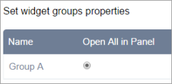
- Open All in Panel—When users click the widget group button, all widgets within the group display in a single panel.
- Show in Drop-down Menu—When users click the widget group button, the widgets within the group display in a drop-down menu.
Configure the Header Controller widget
Complete the following steps to configure the Header Controller widget. (The other controllers don't have configuration options.)
- Hover over the widget and click the Configure this widget button
 to open the configuration window.
The configuration window appears. If there are any widget groups, they display in this window. Otherwise, a message appears, indicating that there is no widget group set.

Tip:
To change a group widget name or icon, go back to the group widget and click the edit button.
- Click the Open All in Panel or Show in Drop-down Menu button next to a group name to set its display style.
- Click OK to save the configuration and close the window.
Use the Controller widget
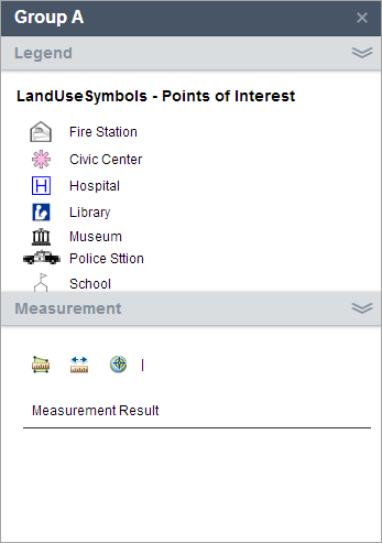
Clicking the group widget button in the Controller widget opens the widgets as defined by the theme or in the configuration for a Header Controller widget. A Header Controller configured with Open All in Panel displays the widgets in a single panel with options to expand or collapse each, similar to the following example:

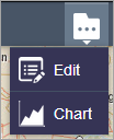
A Header Controller configured with Show in Drop-down Menu provides widget access from a button with a menu, similar to the following example:
