A selector is a type of element that upon selection, can trigger an action. While there are many elements that support selections, a selector can only be added to the header and sidebar on the desktop view and to the drawer in the mobile view. These include the category, number, and date selectors.
Add a selector
Before adding a selector, you must add a header or sidebar to your desktop view, or a drawer to your mobile view. To add a selector, do the following:
- On the dashboard toolbar, click the View button
 to open the View pane.
 - For your desktop view, click either the Header or Sidebar tab in the View pane and do the following:
- Click Add selector.
- Choose a selector type and begin configuring your selector.
- For your mobile view, click the Drawer tab in the View pane and do either of the following:
- Click Add selector. Choose a selector type and begin configuring your selector.
- Click Copy selector to copy a selector configured in your desktop view.
Note:
When you copy a selector from the desktop view, all configuration settings are copied over, except for any actions. To include actions on the mobile view, you will need to configure the actions on the selector again.
Configure a selector
On the Selector tab of the selector's configuration, you can specify properties specific to that selector type, such as how it's displayed. On the Actions tab, you can specify the actions to be triggered by the selector. Depending on where the selector is added, you can choose one of the following presentation modes for a selector:
Note:
Selectors added to the drawer on the mobile view always display in the drop-down mode.- Inline—The selector is always displayed. When using the Inline presentation mode for a selector in a sidebar, you can choose to display your selector as a list or as a button bar.
- Dropdown—The selector is displayed when a selection is being made and closes after.
- Accordion—For selectors in a sidebar, users can keep a selector's display expanded or collapsed.
Note:
On the desktop view, the amount of space selectors occupy can differ depending on how they are configured. Some selector presentation modes and display types are not possible on a header because it has a fixed height. If you can't configure a selector a particular way on a dashboard header, try adding the selector to the sidebar or choosing a different selector configuration. Optionally, you can choose to include an icon next to the selector label. After a selector has been added, you can change its settings by hovering over it and clicking the Configure element button  . You can also change the order in which selectors appear in the sidebar or header by clicking the Move buttons.
Category selector
You can base the categories in a category selector on a list of defined values, features, or summary statistics that are calculated at run time. You can use category selectors with categories derived from features to apply a spatial filter.

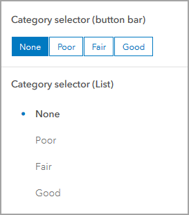
For a category selector, if you choose the Inline presentation mode, you can choose whether your categories are displayed as a list or as a button bar. Accordion and Dropdown presentation modes display the categories as a list. You can also choose whether users can select a single category or multiple categories simultaneously by adjusting the Selection setting. For single category selection, you can enable the None option toggle button, which adds None as a category in the selector, allowing you to have nothing selected.
You can choose the enable the Show search toggle button to allow users to search the list of categories when making selections. When multiple selections are enabled, users can click the Show selected button next to the search bar to narrow the category list to only show the selected categories.
If your selector is based on grouped values, the categories are automatically generated based on the field names in your data. You can change the display label for a category on the Data tab by clicking +Override, entering the category you want to change, and clicking Add. When your category is added, you can change its label. Optionally, you can click Load categories to add all the categories at once and change their labels.
Number selector
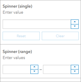
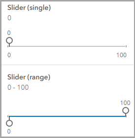
You can base a number selector on a single fixed value or a numeric range. You can choose for dashboard users to select values using a number spinner, slider, or a combination of both. When both are chosen, users can input values using either the number spinner or the slider.


When configuring the spinner display type, you can choose to include value limits and use the Increments option to specify the increments for the spinner values. For the slider display type, a minimum and maximum value are required. You can also choose to use the Precision option to specify the number of decimal points for the slider's values.
Date selector
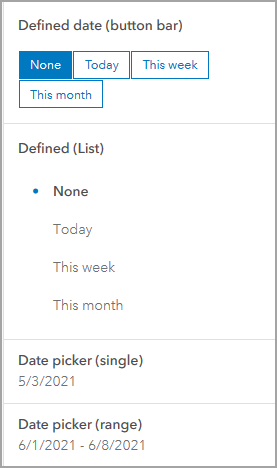
You can configure a date selector to show predefined date and time options, a date and time picker, or a combination of both.

For date selectors with predefined options, you can display the date and time options as either a list or button bar. You can enable the None option toggle button to include a None option, allowing no date to be selected. You can also specify whether the first or last option is selected by default.
For date selectors that display the date picker, you can specify whether the users can choose a single date or range of dates, whether to include a time field, and any default values for the date picker.
Note:
Date picker values are entered in the dashboard time zone.
When a combination of predefined options and a date picker is used, each option has its own tab. You can modify the tab label, along with the default option. The same configuration options are available for each type as when the selector only contains one type.