A serial chart visualizes one or more series of data points along a horizontal (x) axis and a vertical (y) axis. Serial charts show more than one series of data. In the following chart, there are two series of data: one showing crime counts by day and the other showing a three-day rolling average of crime counts. Each series in a serial chart has a type that determines the way the data points are visualized.
In the following example describing the components of a serial chart, the series showing crime counts by day has the column type and the series showing the three-day rolling average of crime counts has the line type.
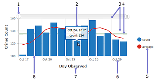
- Scroll bar—Allows users to control the number of data categories displayed.
- Hover text—Displays additional information about a data point while you hover over it.
- Grid lines—Improve chart readability. You can control how horizontal and vertical grid lines are displayed.
- Guides—Provide context to the data being displayed on a chart by representing goals or thresholds. Guides can be lines that represent a single value or a shaded area that represents a range of values. In addition, serial charts can have multiple guides.
- Legend—Conveys the meaning of colors used in the chart. How you configure the data in the chart determines the position of the chart's legend.
- Label—Describes categories and values. Labels are automatically generated; however, you can override them at design time. For instance, when the category axis shows dates, you can adjust their display through date formatting. You can also control value axis labels through unit prefixing or number formatting.
- Axis title—Summarizes the types of categories or values shown on the axis. Each axis can have its own title.
- Axis—One axis in a serial chart displays the category of each data point, while the other axis displays its numeric value. The category axis can show discrete values or continuous values such as dates. In the previous chart, the categories are displayed along the horizontal axis, and the values are displayed along the vertical axis. However, you can reverse this setup. You can display the vertical columns horizontally by changing the orientation of the axes, so that the horizontal axis displays values and the vertical axis displays categories.
Series types
Serial charts can either be column, or line or smooth line charts. Each series type is best suited for a different type of data. You can choose the series type from the Series tab.
Column charts
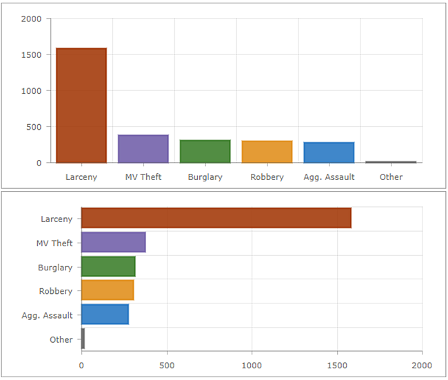
On a column chart, data points in the series are represented by a box where the height of the box is determined by numerical values of points. Columns can be horizontal or vertical, depending on the chart's orientation. Column charts are best suited for data with discrete categories, but you can also use them to display data with continuous categories.
Line and smoothed line charts
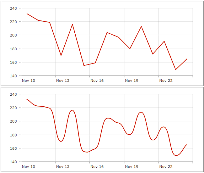
Data with continuous categories, such as dates, are best suited for line and smoothed line charts.
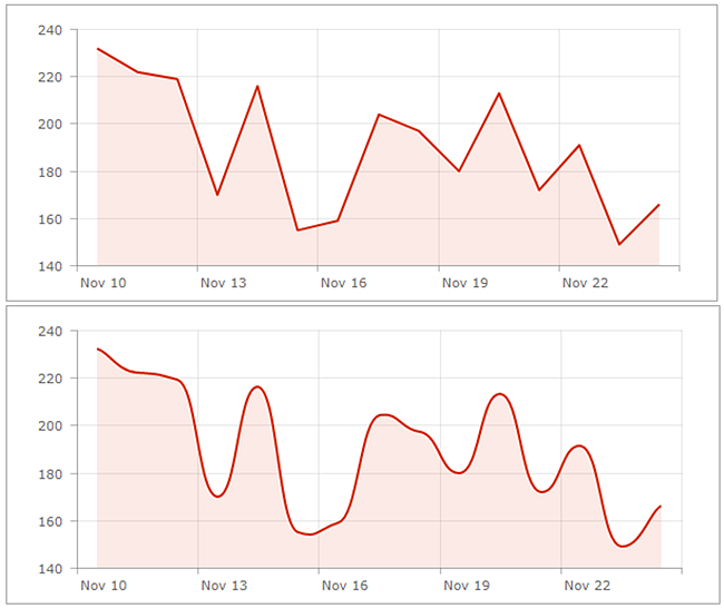
Line and smooth line charts with Parse dates enabled that have missing or empty data points can be configured to either connect the data points or leave breaks in the line. You can turn line and smooth line charts into area charts by increasing their fill opacity in the Series tab.
Multiseries charts
There are two ways to create multiseries charts. The method you use depends on how your chart's categories are determined from its data. If your chart's categories are based on grouped values, you can create a multiseries chart by specifying Split by field. If your chart's categories are based on features, you can manually include multiple series in the chart by clicking Add series. See Data series for details on how to determine the basis of your chart's categories.
When each series in a multiseries chart is a different series type, such as the first chart in this topic, it is considered a combo chart. When all the series are the same type, they can be grouped, stacked, or 100% stacked. When creating multiseries charts, by default it will generate a grouped chart. You can change the stacking in the Series tab.
Tip:
The value axis of a single or multiseries chart can have a logarithmic scale, but not when the series are stacked or 100% stacked.
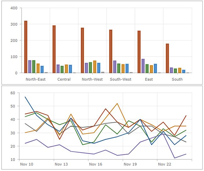
Grouped charts
Grouped charts are used for showing information about different subgroups of main categories. A separate column or line represents each of the subgroups, which are displayed in different colors to distinguish them. When configuring a grouped chart, limit the amount of information to ensure it's easy to understand.
Stacked charts
Stacking allows series to be placed on top of each other without overlapping. A stacked chart is similar to a grouped chart in that it can be used to display information about subgroups that comprise different categories. In a stacked chart, the data points representing subgroups are placed on top of each other (or side by side when the chart is displayed horizontally). Different colors are used to indicate the contributions of the different subgroups. The overall value is the total size of the category.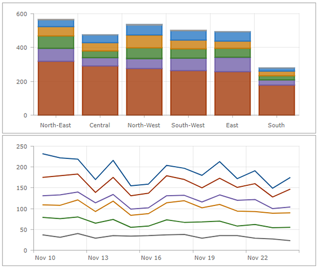
100% stacked charts
A variation of a stacked chart is a 100% stacked chart. This shows relative differences within each category. The total of each column is always 100 percent, and the length of each subgroup is its contribution to the total in terms of percent. 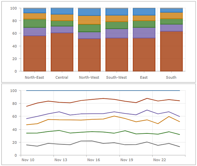
Actions
In an interactive dashboard, a serial chart can be the source or target of an action. When used as the source of an action, the chart can be configured for single or multiple selection mode. This determines the number of data points that you can select at a time. When a chart is the source of actions, it can, for example, trigger a map to pan or zoom, or filter another dashboard element. When a chart is the target of an action such as a map extent change, you can filter the chart so the data it displays corresponds with the map's new extent.