The best dashboards are informative and clear. Effective dashboards should be designed to support real-time situation awareness by expressing performance measures clearly, precisely, and without distraction. Dashboards should get your attention when necessary, make it easy to identify what's most important on the screen, and provide the ability to understand what's happening and respond immediately.
Some best practices for creating effective dashboards include the following:
Determine your audience
A good first step for authoring a dashboard is to determine who is viewing it, and the questions they need answered. The answers to these questions should inform every design decision you make. This information is especially useful when deciding which information is relevant and should be included in the dashboard. When possible, it's best to make a dashboard for one audience, so you can tailor the dashboard to that audience's requirements. One dashboard with information that's relevant to some users but not all isn't as useful as two dashboards that only contain pertinent information for each audience.
Part of determining your dashboard's audience also includes knowing where the dashboard is viewed. For example, if the dashboard is viewed in a dimly lit office, consider using the dark theme to reduce eyestrain. If the dashboard is viewed on a monitor wall, as opposed to a desktop machine, it should be easy to read from a distance. Also, you should author a dashboard to look good at the screen resolution and zoom levels at which it will be displayed. In general, it's recommended to test your dashboard in the workspace it will be used in before sharing it with users.
Avoid information overload
Only include information that users need to know. Information that is not essential can be distracting and decrease the dashboard's usability. Additionally, avoid adding unnecessary visual elements and media to your dashboard. The main objective of a dashboard is to present information clearly, and unnecessary visualizations clutter dashboards. Keeping dashboards simple can also ensure smoother performance.
Provide context when needed
When there's a lot of information available at once, it's hard to bring focus to the information your users want to see. Sometimes the data you're displaying needs context. Stand-alone numbers are often not very useful on their own. Contextual information, such as targets or historical
values, makes current values more meaningful and helps users decide
whether a situation warrants attention. Context can also assist
users in identifying trends and patterns.
You can provide context in your dashboard by setting reference
values in indicators, including
guides in serial charts, or using charts that are more appropriate for showing time-series data, such as line or area charts. 
Context is also important in interactive dashboards. When creating a dashboard that users need to interact with, using selection-based display can be an effective way of ensuring users have the context they need when viewing information. Having dashboard elements display data only when necessary allows you to create dashboards that have a more specific focus and show only relevant data.
Another way of providing context to your dashboard is by notifying users of important events. You can configure your dashboard so that
users are immediately notified when something occurs that requires action. Ideally, include no
more than two notifications in a dashboard to avoid overwhelming users
with noncritical notifications. You can draw attention to updates in a dashboard by using
conditional formatting. This causes an
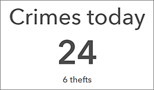
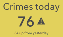
element's appearance to change based on your data. The indicator is one of the elements that supports conditional formatting. For example, you can
configure it to turn yellow and include an exclamation point when the number of
crimes has increased by more than 20 compared to yesterday, and appear with a white background the rest of the time, so that you can easily tell whether or not the number of crimes has significantly increased. You can also use advanced formatting in supported elements to apply conditional formatting using an ArcGIS Arcade expression.
Make good design choices
Your dashboard layout can be instrumental in its overall effectiveness. Organize and size elements based on their importance and relationships with each other. The elements with the most important information should be the largest and have the most prominent locations in the dashboard. Consider how users typically read a dashboard, for example, from top to bottom or left to right, and organize your information accordingly. Take advantage of element grouping for related elements so that they always appear next to each other and it's easier to see their close relationship. The map and map legend elements, as well as the list and details elements, can often be grouped together.
A common design problem with dashboards is that they have too much color. This can make them visually overwhelming and difficult to read. Only use color to display data differences, and when other methods to do so aren't as effective. When you do use color, take advantage of the default color sets available in certain elements, such as serial and pie charts. These color sets are designed to look good together. Using a color contrast checker is another good practice to follow to ensure your color choices are effective.